
.webp)
You know her, and you probably love her. From the iconic IKEA blue to a nod to OG Bauhaus design, I’ve seen great use of this color in designs. In this article, we'll cover the following about decorating with cobalt blue, otherwise known as lapis lazuli, ultramarine, or deep blue.


Like other primary colors on the color wheel, the color blue comes from nature in the form of a pigment derived from a rock—in this case, it's the semi-precious stone lapis lazuli. According to ColorPsychology.org, the stone can only be found in the mountains of Afghanistan, making it rare and more valuable than gold in the old ages, as it took grinding the stone and combining it with waxes and resins to create an applicable mixture. The pigment was extremely important to Egyptians, and Cleopatra was known for wearing the pigment as eyeshadow—a luxury indeed reserved for a Queen!
Lapis lazuli, aka ultramarine, is known to represent the purest of all blues. The Paris Review notes, "Ultramarine: the quality of the shade is embodied in its name. This is the superlative blue, the end-all blue, the blue to which all other hues quietly aspire. The name means "beyond the sea"—a dreamy ode to its distant origins, as romantic as it is imprecise."
Since the ultramarine pigment was so expensive, fine artists had to be very intentional with how they used the color. The Paris Review notes that even "Michelangelo couldn't afford ultramarine. His painting The Entombment… was left unfinished due to his failure to procure the prized pigment." This is why we see the color reserved for Catholic paintings of the Virgin Mary or Jesus in Europe. It is said that blue was chosen to reflect a sense of peace and purity.
According to Color Psychology, this color blue can promote trust, confidence, and dependability and can boost creativity even when you are under stress. However, it can also have negative associations, including sensitivity and sadness. Further, there are certain things to remember when decorating with blue, especially when using the vibrant color in kitchens, as it can suppress appetite and increase thirst.
Regarding ultramarine color in the modern art world, count artist Yves Klein as the color's biggest fan. His concentration was on monochromatic artwork, and as a Catholic man and the child of highly acclaimed artists, he knew the historical value of the color in the great renaissance. After failed attempts in his multi-colored works, he adopted ultramarine as his signature color and even tailored it further to optimize its vibrancy. Invaluable notes that the artist achieved his signature pigment —with the help of art supplier and chemist Edouard Adam— by using the "pure, dry ultramarine pigment…suspended in clear synthetic resin and other solvents like petroleum.
The key to the vibrancy of this shade lay(s) in the colorless carrier, which does not dull individual pigment particles but leaves them with their original vivid hue." The artist's works were highly acclaimed, the color cementing itself as a mainstay in the modern design world.

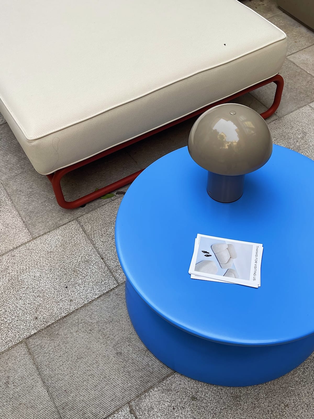
The vibrant shade is electrifying, so it's the perfect color to play with, even if neutrals are your main decor. It is a color that instantly modernizes a space and can be the ideal gateway to other color combinations. Below are three ways to implement the color into your home decor, either as small accents or go all out by adopting large pieces of furniture in the shade.
Want to lean into the color's playfulness? There is no better companion to the solid color than implementing some graphic lines into the room. Linework pairs with it particularly well as it matches the colors' energy and by working in some strong contrasting colors, you get a pop art kind of feel. Bringing in some neutral tones or softer shades of blue only help to ground the vignette, avoiding total chaos.
Yves Klein even used his color, IKB, in his Parisian apartment, combining his artworks with otherwise simple white walls and neutral brown tones. Adding in some subdued textures helps bring out the serene nature of the color while still looking very modern and crisp. But, of course, the style is buildable! If you want to add to the look, doubling down to wood tones or adding in some other colors typically works like a charm.
If you love pops of color and some of your favorite influences include Memphis Design and the iconic Bauhaus style, cobalt blue is the perfect color to introduce into your decor. It pairs up nicely with other primary tones, such as red and yellow, and can look striking when combined. When using the colors together, being intentional with the usage of white space can make all the difference in the final design. The configurations are endless!

You know her, and you probably love her. From the iconic IKEA blue to a nod to OG Bauhaus design, I’ve seen great use of this color in designs. In this article, we'll cover the following about decorating with cobalt blue, otherwise known as lapis lazuli, ultramarine, or deep blue.
Like other primary colors on the color wheel, the color blue comes from nature in the form of a pigment derived from a rock—in this case, it's the semi-precious stone lapis lazuli. According to ColorPsychology.org, the stone can only be found in the mountains of Afghanistan, making it rare and more valuable than gold in the old ages, as it took grinding the stone and combining it with waxes and resins to create an applicable mixture. The pigment was extremely important to Egyptians, and Cleopatra was known for wearing the pigment as eyeshadow—a luxury indeed reserved for a Queen!
Lapis lazuli, aka ultramarine, is known to represent the purest of all blues. The Paris Review notes, "Ultramarine: the quality of the shade is embodied in its name. This is the superlative blue, the end-all blue, the blue to which all other hues quietly aspire. The name means "beyond the sea"—a dreamy ode to its distant origins, as romantic as it is imprecise."
Since the ultramarine pigment was so expensive, fine artists had to be very intentional with how they used the color. The Paris Review notes that even "Michelangelo couldn't afford ultramarine. His painting The Entombment… was left unfinished due to his failure to procure the prized pigment." This is why we see the color reserved for Catholic paintings of the Virgin Mary or Jesus in Europe. It is said that blue was chosen to reflect a sense of peace and purity.
According to Color Psychology, this color blue can promote trust, confidence, and dependability and can boost creativity even when you are under stress. However, it can also have negative associations, including sensitivity and sadness. Further, there are certain things to remember when decorating with blue, especially when using the vibrant color in kitchens, as it can suppress appetite and increase thirst.
Regarding ultramarine color in the modern art world, count artist Yves Klein as the color's biggest fan. His concentration was on monochromatic artwork, and as a Catholic man and the child of highly acclaimed artists, he knew the historical value of the color in the great renaissance. After failed attempts in his multi-colored works, he adopted ultramarine as his signature color and even tailored it further to optimize its vibrancy. Invaluable notes that the artist achieved his signature pigment —with the help of art supplier and chemist Edouard Adam— by using the "pure, dry ultramarine pigment…suspended in clear synthetic resin and other solvents like petroleum.
The key to the vibrancy of this shade lay(s) in the colorless carrier, which does not dull individual pigment particles but leaves them with their original vivid hue." The artist's works were highly acclaimed, the color cementing itself as a mainstay in the modern design world.
The vibrant shade is electrifying, so it's the perfect color to play with, even if neutrals are your main decor. It is a color that instantly modernizes a space and can be the ideal gateway to other color combinations. Below are three ways to implement the color into your home decor, either as small accents or go all out by adopting large pieces of furniture in the shade.
Want to lean into the color's playfulness? There is no better companion to the solid color than implementing some graphic lines into the room. Linework pairs with it particularly well as it matches the colors' energy and by working in some strong contrasting colors, you get a pop art kind of feel. Bringing in some neutral tones or softer shades of blue only help to ground the vignette, avoiding total chaos.
Yves Klein even used his color, IKB, in his Parisian apartment, combining his artworks with otherwise simple white walls and neutral brown tones. Adding in some subdued textures helps bring out the serene nature of the color while still looking very modern and crisp. But, of course, the style is buildable! If you want to add to the look, doubling down to wood tones or adding in some other colors typically works like a charm.
If you love pops of color and some of your favorite influences include Memphis Design and the iconic Bauhaus style, cobalt blue is the perfect color to introduce into your decor. It pairs up nicely with other primary tones, such as red and yellow, and can look striking when combined. When using the colors together, being intentional with the usage of white space can make all the difference in the final design. The configurations are endless!
We are an online interior design studio for enthusiasts and professionals. Get a real-world design education, easy-to-use tools, job opportunities, and a tight-knit community. All levels welcome.
Join now
