

Color is the easiest way to transform a space, and as a fellow color enthusiast and maximalist, I’m brimming with excitement over IKEA’s latest collaboration with Raw Color: TESAMANNS. The collection is filled with bright shades of blue, orange, red, pink, and yellow. If you follow color theory, you know these colors evoke cheerful and calming moods.


No one understands the concept of color theory better than Raw Color — they are constantly studying how colors interact with light, materials, and movement. Daniera ter Haar and Christoph Brach of Raw Color have been dreaming up their furniture and product-based creations from their studio in Eindhoven, Netherlands, since 2008. They describe themselves as a pair that “works across design disciplines to materialize color by blending the fields of Graphic Design, Photography, and Product Design.” Their graphic design inspiration definitely shines through in their newest collection with IKEA, channeling its way through bold stripes, shapes, colors, and repeat patterns on a range of textiles and furniture. Color plays a key role in this collection, which is to be expected, if not craved, from a brand named Raw Color.
Christoph Brach of Raw Color elaborates on their color philosophy: “We have an emotional and intuitive approach to color, exploring how different shades interact to enhance each other. Colors are never solitary; they thrive in company. It's akin to crafting a recipe where the perfect balance makes an object truly shine.”
The TESAMANNS collection, which will launch on April 1st, consists of 18 different products that represent how color can transform your average, everyday item into something magical and fun. There’s no such thing as boring decor here — not even a rolling cart deserves to be dull!
Let’s dive into our favorite IKEA x Raw Color products in this collection.
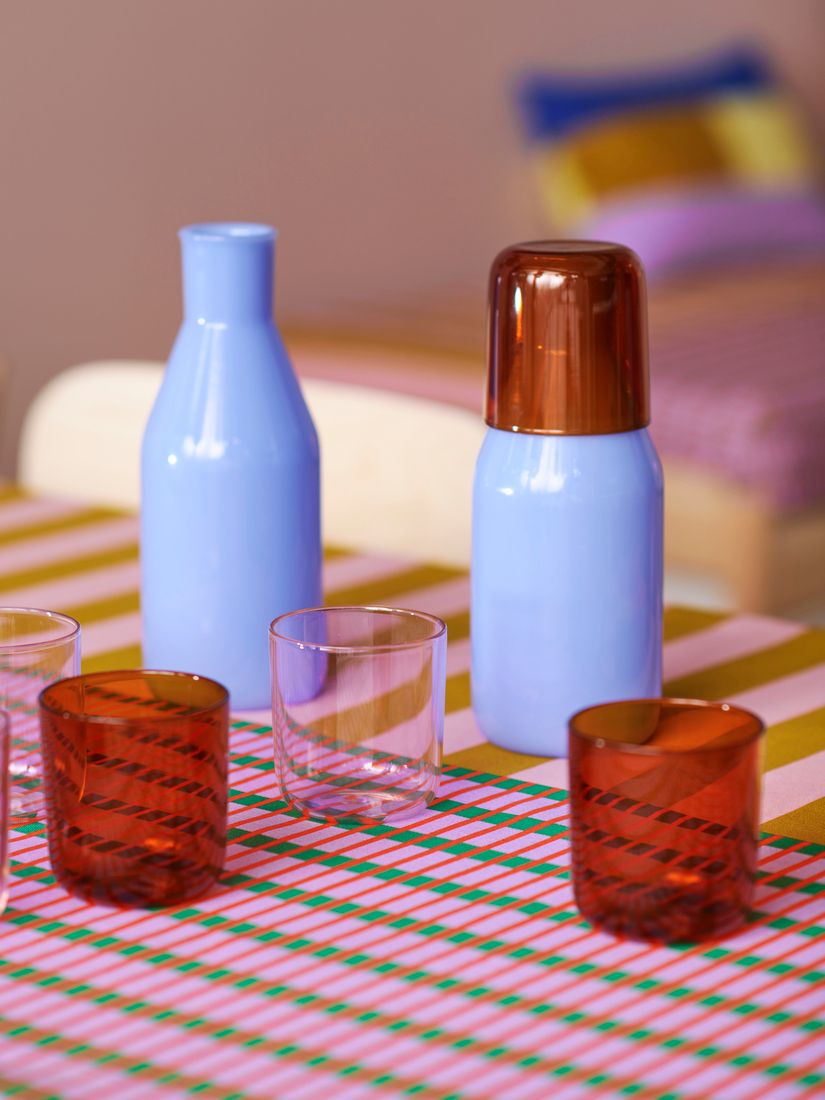
I wouldn’t expect anything less than a mix-and-match set of glasses in periwinkle, amber, and pink. The contrast between the colors and glass is key to making it stand out. I can already feel the varying visual weights at play with these three sets interacting with each other on an outdoor brunch summer tablescape.
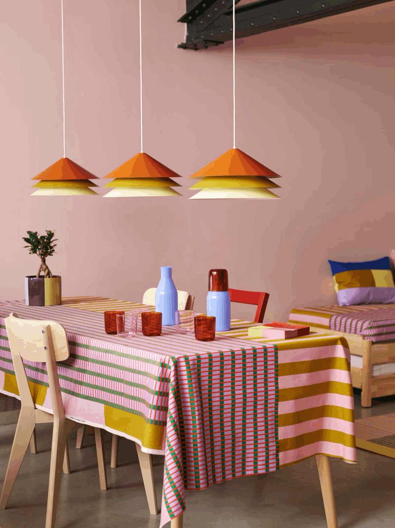
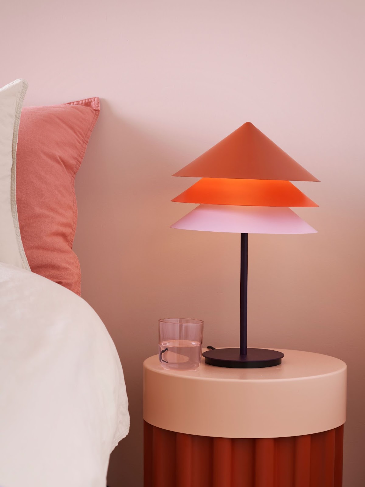
These lampshades have a seemingly simple shape and material, but they stand out with their repetition and color range. Yes, you’re seeing that correctly—that’s three lampshades stacked perfectly on each other! All good things come in threes, right? The hanging pendants feature a juicy citrus color palette, which would look perfect in a room painted in a contrasting color.
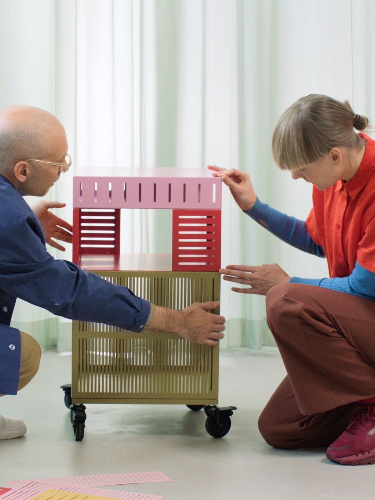
One of my favorites in the whole collection, the TESAMANNS storage unit’s mobility allows for the creation of a moiré effect — an optical illusion where overlapping patterns generate an undulating pattern, illustrating the lively interplay between colors, shapes, and movement.
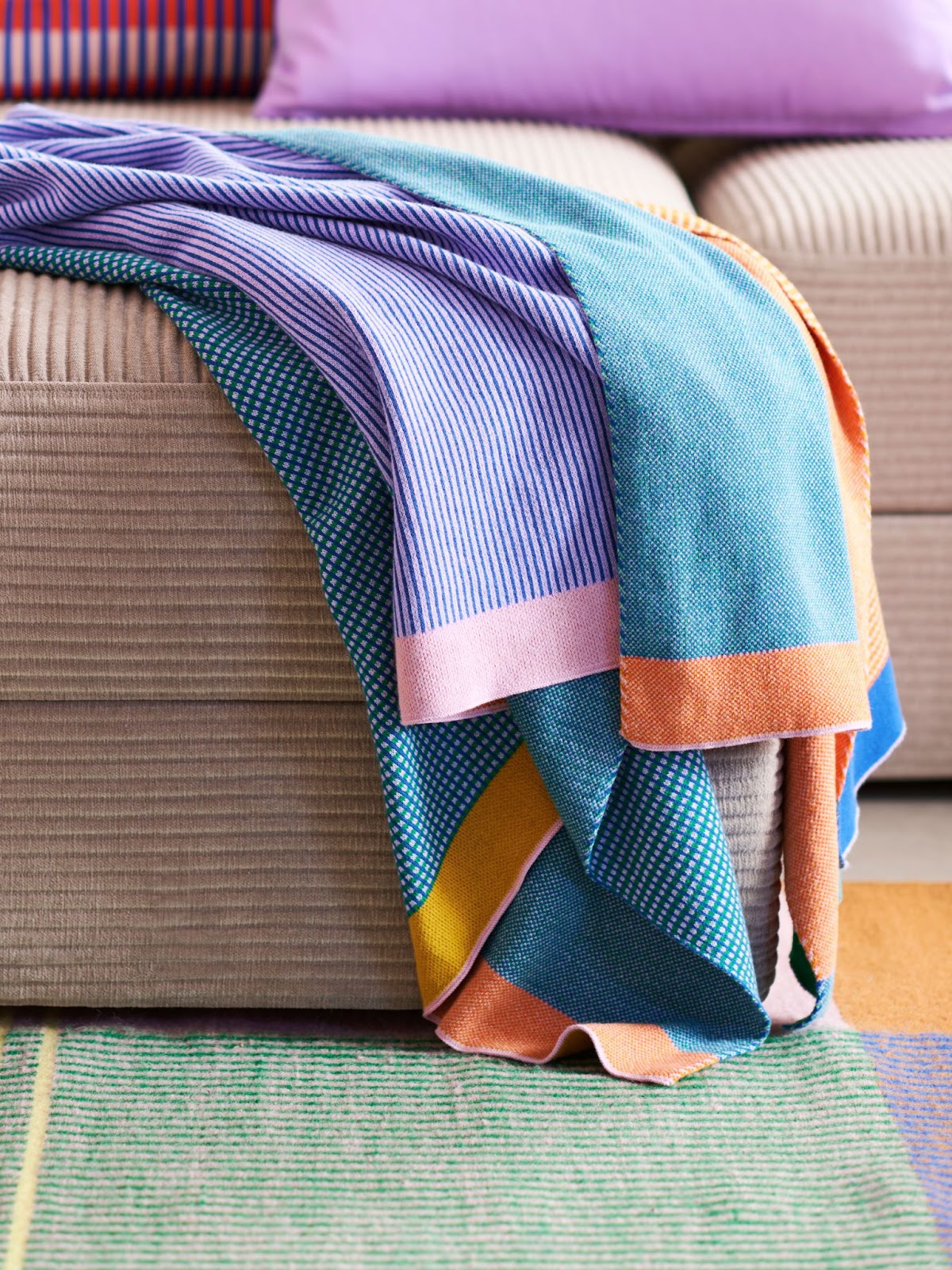
Taking it even further, the TESAMANS knitted throw epitomizes this concept, with graphic lines and solid colors that merge into a single shade from afar, revealing distinct colors upon closer inspection. If this color palette doesn’t lift your mood every time you curl up with your knit or fold and place it in its home, we don’t know what will.
The party doesn’t stop here! The Raw Color TESAMANNS collection also includes pillows, tablecloths, vases, and a clock—oh my! We can’t wait for the entire collection to launch on April 1st, but these sneak peek photos are just enough to hold us over until then.
Maria O’Brian, Creative Leader at IKEA of Sweden, expresses the collaboration's intent: "With TESAMAnNS, we aim to inspire self-expression and daily joy. This partnership facilitates the addition of unique design elements, enabling the creation of colorful spaces that mirror individual personalities." She adds, "Raw Color's innovative, creative process has inspired and challenged us to engage with colors in novel ways."
Different colors create different emotional responses, and we can use this to our advantage at home. In the TESAMANNS collection, we see bright and contrasting colors at play, which work together to create a cheerful emotional response. Here is the color psychology behind some of the shades and hues of TESAMANNS:
Yellow: Warmth, joy, friendship
Red: Strength, power, love
Pink: Healing, peace, euphoria
Green: Happy, lucky, patient
Blue: Calm, relaxed, peaceful
Choose your emotions, and go with the corresponding color.
Once you have a few color selections on hand, it’s time to consult the color wheel. Complementary colors will always live opposite of each other and will provide the biggest contrast you can find on the color wheel. Want something more harmonious? There are a few different routes to take. Mixing two primary colors in your color palette will give you what the color wheel calls “secondary” colors. Mix a primary color with a secondary color, and you're in tertiary territory. By using these three systems, your color palette will always be in harmony. Want to see how all of your colors work together? Use our Color Pal tool, an easy-to-use color palette generator.
The TESAMANNS collection uses primary and secondary colors. It focuses on yellow, red, and blue while incorporating pinks, greens, and purples. As we’ve seen in the harmonious balance of this collection, this color palette is a no-fail for happiness.

As we anxiously await the collection's launch, let's embrace the possibilities of color and express our unique personalities through design!

Color is the easiest way to transform a space, and as a fellow color enthusiast and maximalist, I’m brimming with excitement over IKEA’s latest collaboration with Raw Color: TESAMANNS. The collection is filled with bright shades of blue, orange, red, pink, and yellow. If you follow color theory, you know these colors evoke cheerful and calming moods.

No one understands the concept of color theory better than Raw Color — they are constantly studying how colors interact with light, materials, and movement. Daniera ter Haar and Christoph Brach of Raw Color have been dreaming up their furniture and product-based creations from their studio in Eindhoven, Netherlands, since 2008. They describe themselves as a pair that “works across design disciplines to materialize color by blending the fields of Graphic Design, Photography, and Product Design.” Their graphic design inspiration definitely shines through in their newest collection with IKEA, channeling its way through bold stripes, shapes, colors, and repeat patterns on a range of textiles and furniture. Color plays a key role in this collection, which is to be expected, if not craved, from a brand named Raw Color.
Christoph Brach of Raw Color elaborates on their color philosophy: “We have an emotional and intuitive approach to color, exploring how different shades interact to enhance each other. Colors are never solitary; they thrive in company. It's akin to crafting a recipe where the perfect balance makes an object truly shine.”
The TESAMANNS collection, which will launch on April 1st, consists of 18 different products that represent how color can transform your average, everyday item into something magical and fun. There’s no such thing as boring decor here — not even a rolling cart deserves to be dull!
Let’s dive into our favorite IKEA x Raw Color products in this collection.
I wouldn’t expect anything less than a mix-and-match set of glasses in periwinkle, amber, and pink. The contrast between the colors and glass is key to making it stand out. I can already feel the varying visual weights at play with these three sets interacting with each other on an outdoor brunch summer tablescape.

These lampshades have a seemingly simple shape and material, but they stand out with their repetition and color range. Yes, you’re seeing that correctly—that’s three lampshades stacked perfectly on each other! All good things come in threes, right? The hanging pendants feature a juicy citrus color palette, which would look perfect in a room painted in a contrasting color.

One of my favorites in the whole collection, the TESAMANNS storage unit’s mobility allows for the creation of a moiré effect — an optical illusion where overlapping patterns generate an undulating pattern, illustrating the lively interplay between colors, shapes, and movement.

Taking it even further, the TESAMANS knitted throw epitomizes this concept, with graphic lines and solid colors that merge into a single shade from afar, revealing distinct colors upon closer inspection. If this color palette doesn’t lift your mood every time you curl up with your knit or fold and place it in its home, we don’t know what will.

The party doesn’t stop here! The Raw Color TESAMANNS collection also includes pillows, tablecloths, vases, and a clock—oh my! We can’t wait for the entire collection to launch on April 1st, but these sneak peek photos are just enough to hold us over until then.
Maria O’Brian, Creative Leader at IKEA of Sweden, expresses the collaboration's intent: "With TESAMAnNS, we aim to inspire self-expression and daily joy. This partnership facilitates the addition of unique design elements, enabling the creation of colorful spaces that mirror individual personalities." She adds, "Raw Color's innovative, creative process has inspired and challenged us to engage with colors in novel ways."
Different colors create different emotional responses, and we can use this to our advantage at home. In the TESAMANNS collection, we see bright and contrasting colors at play, which work together to create a cheerful emotional response. Here is the color psychology behind some of the shades and hues of TESAMANNS:
Yellow: Warmth, joy, friendship
Red: Strength, power, love
Pink: Healing, peace, euphoria
Green: Happy, lucky, patient
Blue: Calm, relaxed, peaceful
Choose your emotions, and go with the corresponding color.
Once you have a few color selections on hand, it’s time to consult the color wheel. Complementary colors will always live opposite of each other and will provide the biggest contrast you can find on the color wheel. Want something more harmonious? There are a few different routes to take. Mixing two primary colors in your color palette will give you what the color wheel calls “secondary” colors. Mix a primary color with a secondary color, and you're in tertiary territory. By using these three systems, your color palette will always be in harmony. Want to see how all of your colors work together? Use our Color Pal tool, an easy-to-use color palette generator.
The TESAMANNS collection uses primary and secondary colors. It focuses on yellow, red, and blue while incorporating pinks, greens, and purples. As we’ve seen in the harmonious balance of this collection, this color palette is a no-fail for happiness.

As we anxiously await the collection's launch, let's embrace the possibilities of color and express our unique personalities through design!

We are an online interior design studio for enthusiasts and professionals. Get a real-world design education, easy-to-use tools, job opportunities, and a tight-knit community. All levels welcome.
Join now