
.webp)
We love a bold kitchen cabinetry moment, especially when it involves a little (or a lot of) color! While white kitchen cabinets may be the answer for some spaces, we're here to make a case for considering playful tones to add personality and dimension to the heart of the home.
Whether you're designing from the ground up, remodeling, or taking on a project to give your old cabinets new life, you want to be sure you are choosing a shade you will love and want to live with for a while. So if you're looking for some colorful kitchen cabinetry inspiration, scroll on for ten hues that make a statement.


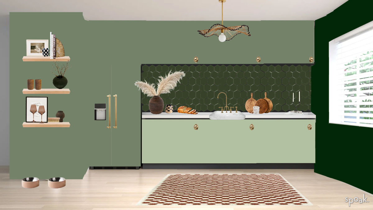
This tonal kitchen Vizi by Spoak member Tyra Trotman shows off one of our favorite shades — Backdrop's Lawn Party. It feels both bold and calming paired with a dark green backsplash and a lighter green bottom cabinets, and we love how the warm accents on the rug and brass hardware bring the perfect contrast. Tyra discovered this color during one of our Daily Play Challenges and plans to use it IRL soon for an office makeover!
There's just something about a pink kitchen, and this one painted with Sulking Room Pink from Farrow & Ball by Wit & Delight will be living rent-free in our minds until further notice. It is equal parts playful and sophisticated and feels even more interesting paired with that stunning veined marble.
Our recent Wine & Design guest, Ali LaBelle, took the plunge to paint her kitchen during quarantine in Clare Paint's Avocado Toast, and we haven't stopped swooning over it since. She painted it herself with the help of friends over a few weekends (more info on that in her IG highlight here), and we love how much light the tone brought into the space.
When thinking of blue cabinets, it's hard not to think of designer Athena Calderone's stunning Brooklyn kitchen. Farrow & Ball's Railings in Estate Eggshell feels inviting and statement-making against the beautifully veined marble and white plaster hood, reading neutral without falling flat.
Why choose one color when you can choose two? This dreamy pastel kitchen painted in the colors Carys (top cabinets), and Confetti (bottom cabinets) by Little Greene Paint Company stopped our scroll when we saw it on IG via @wiltshirewonderland, and we haven't forgotten it since!
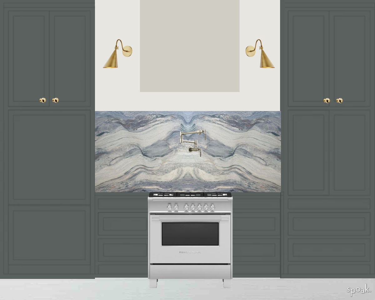
Spoak member Diana Farberov created a Vizi to try on Farrow & Ball's Studio Green — the color she selected for her future kitchen. We can already picture how beautiful it will be IRL and can't wait to see it come to fruition!
This kitchen designed by Cochineal Design makes us want to raise our glass to more rich wine-hued cabinetry in the future. Farrow & Ball's Preference Red brings a cozy and intimate feeling to this space and adds just the right amount of drama while remaining timeless and intentional.
It's hard not to love Matilda Goad's kitchen, and Sage Green by Little Greene Paints sets the tone for the cabinetry bringing the most beautiful base to house the eye-catching accents incorporated throughout. We love how neutral this color reads against the pink plaster walls and playful checkered-tile backsplash and think it's a great versatile option for kitchens of every style!
Black cabinets can be the perfect way to add some interest and dimension while still staying in the neutral zone, and we love how Dark Arts from Backdrop feels in this Viz by Spoak member Ivonne Ortiz.
.jpeg)
This bright, eye-catching blue, Brooklyn Blue by Graham & Brown, gives us quite the serotonin boost for a cool-toned shade. We love how @mydiyplaybook paired it with a cheery wallpaper and baby pink backsplash, but we can also picture it adding a burst of personality to contrast more neutral finishes.
Photo Credit: (Left) Domino

We love a bold kitchen cabinetry moment, especially when it involves a little (or a lot of) color! While white kitchen cabinets may be the answer for some spaces, we're here to make a case for considering playful tones to add personality and dimension to the heart of the home.
Whether you're designing from the ground up, remodeling, or taking on a project to give your old cabinets new life, you want to be sure you are choosing a shade you will love and want to live with for a while. So if you're looking for some colorful kitchen cabinetry inspiration, scroll on for ten hues that make a statement.
This tonal kitchen Vizi by Spoak member Tyra Trotman shows off one of our favorite shades — Backdrop's Lawn Party. It feels both bold and calming paired with a dark green backsplash and a lighter green bottom cabinets, and we love how the warm accents on the rug and brass hardware bring the perfect contrast. Tyra discovered this color during one of our Daily Play Challenges and plans to use it IRL soon for an office makeover!
There's just something about a pink kitchen, and this one painted with Sulking Room Pink from Farrow & Ball by Wit & Delight will be living rent-free in our minds until further notice. It is equal parts playful and sophisticated and feels even more interesting paired with that stunning veined marble.
Our recent Wine & Design guest, Ali LaBelle, took the plunge to paint her kitchen during quarantine in Clare Paint's Avocado Toast, and we haven't stopped swooning over it since. She painted it herself with the help of friends over a few weekends (more info on that in her IG highlight here), and we love how much light the tone brought into the space.
When thinking of blue cabinets, it's hard not to think of designer Athena Calderone's stunning Brooklyn kitchen. Farrow & Ball's Railings in Estate Eggshell feels inviting and statement-making against the beautifully veined marble and white plaster hood, reading neutral without falling flat.
Why choose one color when you can choose two? This dreamy pastel kitchen painted in the colors Carys (top cabinets), and Confetti (bottom cabinets) by Little Greene Paint Company stopped our scroll when we saw it on IG via @wiltshirewonderland, and we haven't forgotten it since!
Spoak member Diana Farberov created a Vizi to try on Farrow & Ball's Studio Green — the color she selected for her future kitchen. We can already picture how beautiful it will be IRL and can't wait to see it come to fruition!
This kitchen designed by Cochineal Design makes us want to raise our glass to more rich wine-hued cabinetry in the future. Farrow & Ball's Preference Red brings a cozy and intimate feeling to this space and adds just the right amount of drama while remaining timeless and intentional.
It's hard not to love Matilda Goad's kitchen, and Sage Green by Little Greene Paints sets the tone for the cabinetry bringing the most beautiful base to house the eye-catching accents incorporated throughout. We love how neutral this color reads against the pink plaster walls and playful checkered-tile backsplash and think it's a great versatile option for kitchens of every style!
Black cabinets can be the perfect way to add some interest and dimension while still staying in the neutral zone, and we love how Dark Arts from Backdrop feels in this Viz by Spoak member Ivonne Ortiz.
This bright, eye-catching blue, Brooklyn Blue by Graham & Brown, gives us quite the serotonin boost for a cool-toned shade. We love how @mydiyplaybook paired it with a cheery wallpaper and baby pink backsplash, but we can also picture it adding a burst of personality to contrast more neutral finishes.
Photo Credit: (Left) Domino
We are an online interior design studio for enthusiasts and professionals. Get a real-world design education, easy-to-use tools, job opportunities, and a tight-knit community. All levels welcome.
Join now
